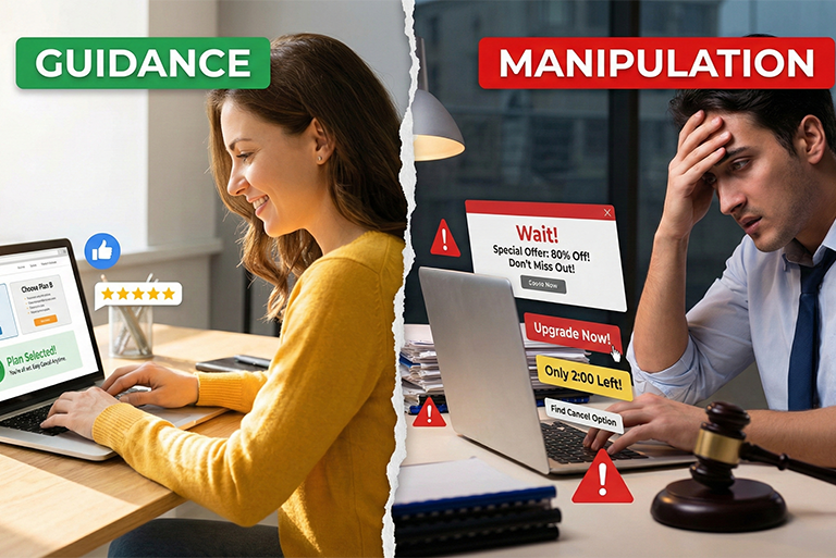
From Guidance to Manipulation: the New Reality of UX
09
Feb
-
 Manoj Kumar
12 Min Read
Manoj Kumar
12 Min Read
Executive Summary:
- The Problem: Many businesses confuse Conversion Rate Optimization (CRO) with manipulation, utilizing “dark patterns” to trick users.
- The Risk: While these tactics boost short-term numbers, they destroy Customer Lifetime Value (CLTV) and invite legal scrutiny (FTC/EU).
- The Solution: Shifting from deceptive design to “Ethical Growth”—strategies that align user goals with business KPIs.
- The Next Step: Download our Ethical UX Audit Checklist to foolproof your platform.
Introduction: Your UX might be converting… and still harming your business
Let’s be honest for a second. We all want the business revenue graph to trend upward.
As a founder or product leader, the pressure to hit KPIs is relentless. You need sign-ups and checkouts, and they need to happen yesterday. In that high-pressure environment, it is highly tempting to make design choices that nudge users too aggressively.
But there is a razor-thin line in our industry right now. On one side, you have persuasive design—helping users find value. On the other hand, you have manipulation—tricking users into doing things they didn’t intend to do.
This is the reality of “Dark patterns in UX.”
I’ve seen metrics spike overnight because a “Cancel” button was hidden, or a pre-checked box opted users into a subscription. It feels like a win during the Monday morning meeting. But six months later? Churn skyrockets, brand sentiment tanks, and you’re left wondering why your bucket has a hole in it.
Today, we’re cutting through the noise. We are examining why the era of manipulative design is ending and how to build a high-converting product that doesn’t trick customers.
If your growth looks fine, but your refunds, chargebacks, cancellations, negative reviews, or support tickets keep climbing, your UX may be “winning” in the worst way.
This is the new reality: deceptive patterns (dark patterns) in UX can boost conversion in the short term, but they also create hidden costs:
- churn that doesn’t show up until month 2–3
- customer trust decay
- brand hate on social + founder reputation damage
- legal exposure (especially in the EU and privacy flows) Digital Services Acts
In this post, I’ll break down:
- Where the line is between guidance and manipulation
- The most common patterns leaders accidentally approve
- How regulators and platforms are cracking down
- A practical framework to redesign your product without killing growth
Why is this problem exploding right now
Three reasons.
1) Growth pressure + A/B testing makes “sludge” feel normal
When teams measure only “conversion up,” they often stop asking “conversion for whom, at what cost?” NN/g explicitly calls out that deceptive patterns are effective at boosting conversions, which is exactly why they spread. NN/Group
2) Product UI is now regulated like marketing claims
The EU Digital Services Act explicitly prohibits online interface designs that deceive/manipulate users or materially distort free decision-making. EU DSA
Privacy regulators are also using the “dark patterns” language directlyCPPA Enforcement
3) Dark patterns have become “packaged.”
Academic research has found dark patterns at scale across thousands of shopping sites, indicating they are neither rare nor accidental. Arxiv
Guidance vs Manipulation – the line is simpler than people pretend
Here’s the line I use when reviewing product flows:
Guidance = helps users make an informed choice they’ll still feel good about later.
Manipulation = pushes users toward an outcome they wouldn’t pick with clear, balanced information.
Quick comparison table (save this for your design reviews)
| Area | Ethical guidance | Manipulative UX |
| Choice | Clear options, equal effort | One option is hidden or painful |
| Language | Neutral, informative | Shame, fear, guilt, fake urgency |
| Defaults | User-benefit defaults | Company-benefit defaults |
| Consent | Specific + reversible | Confusing + sticky |
| Cancellation | Easy, obvious | “Subscription trap” style friction |
Reality check: If your team says “everyone does it,” that’s not a defense. That’s how industries get regulated.
The most common deceptive patterns that leaders accidentally approve
Below are the patterns I see most often in startups and mid-sized SaaS companies that are usually approved because they look “standard.”
1) Subscription traps (the silent revenue killer)
You make signing up smooth, but cancellation feels like a maze. This is exactly the kind of pattern regulators highlight.
Where it shows up:
- The cancel button is hidden behind 4 screens
- “pause” pushed harder than “cancel.”
- Confusing plan names (Basic / Starter / Standard)
- Accidental upgrades
2) Interface interference (visual bullying)
One button is loud, the other is greyed out or visually “disabled,” even when it’s a real option. The EDPB explicitly warns about these UI tricks in social platform interfaces.
3) Confirm-shaming
“No thanks, I hate saving money” style copy.
It works short-term. It also creates a brand smell you can’t wash off.
4) Cookie banner dark patterns
Regulators are openly targeting banners that make “accept” easy and “reject” hard. The French regulator, CNIL, has issued formal notices regarding dark patterns in cookie banners.
5) Disguised ads and misdirection
The FTC calls out tactics such as disguising ads as independent content and burying key terms.
Real-world examples
Let’s talk examples without pretending this is “small stuff.”
- The Federal Trade Commission publicly accused Amazon of using dark patterns in Prime enrollment and making cancellation difficult.
- Researchers found dark patterns across ~11K shopping sites in a large-scale crawl study—this is structural, not occasional.
- In the EU, Article 25 of the DSA explicitly targets manipulative interface design.
- Privacy regulators increasingly treat “consent gained via dark patterns” as invalid consent (example: California privacy regulator advisory language).
What this means for you:
Even if you’re not a giant platform, the “UI as enforcement surface” trend is moving downward. If you plan to scale globally or sell into regulated markets, you want your UX clean now—not after a crisis.
The business cost of manipulative UX
Deceptive UX often creates “good numbers” that hide underlying poor physics.
Hidden cost checklist
- Support load rises (people feel tricked, not helped)
- Refunds + disputes rise (silent margin leakage)
- Brand trust drops (harder to upsell later)
- Churn rises (especially after the first billing cycle)
- Employee morale drops (good teams hate building traps)
And here’s the big one: trust is compounding. If your UX erodes trust, your CAC increases over time as the market cools.
If you’re a founder: ask yourself one brutal question – Are we building customers… or are we extracting customers?
A practical “Ethical Influence” framework you can apply this week
You don’t fix this with a manifesto. You fix it with a review system.
Step 1: Map the “high-risk moments”
These moments are where dark patterns usually sneak in:
- pricing + plan selection
- trial → paid conversion
- consent (cookies, tracking, data sharing)
- cancellation/downgrade
- upsells and add-ons
Step 2: Score each screen with 5 tests (0–2 each)
Ethical Influence Score (0–10):
- Clarity: Do users understand what happens next?
- Balance: Are options equally visible and reachable?
- Reversibility: Can users undo easily?
- Truthfulness: Is urgency real and verifiable?
- User benefit: Would a reasonable user feel respected?
Rule: Anything below 7/10 needs redesign before scaling traffic.
Step 3: Replace manipulation with legitimate persuasion
Instead of fake urgency, use:
- Real inventory limits (with proof)
- Transparent pricing breakdowns
- “Why this plan fits you” guided selection
- Comparison tables
- Demo videos and onboarding previews
That’s how you keep conversion and reduce regret.
FREE! Download: “Dark Pattern Risk Audit Kit (2026)”
Which Includes:
- Dark Pattern Risk Checklist (pricing, trial, consent, cancel)
- Ethical Influence Scorecard (10-point screen scoring)
- Copy swipe file (neutral, compliant alternatives to confirm-shaming)
- Exec-ready 1-page summary you can forward to Legal/Compliance
Why UXGen Studio is the best partner for solving this

Most agencies will redesign UI. That’s easy.
What’s hard is redesigning without losing growth, while reducing regulatory and trust risk.
This is how we approach it at UXGen Studio:
- Dark Pattern Risk Audit mapped to revenue events (trial, cancel, upsell, consent)
- Behavioral UX review that separates ethical persuasion from coercion
- Experiment design that measures regret signals (refunds, cancellations, complaints), not just clicks
- Executive-ready recommendations: what to change, why, impact, and rollout plan
- AI-assisted pattern detection to scale review across screens faster (than human validation, always)
Case study
Client context: Mid-size subscription SaaS (B2B), ~25K monthly signups.
Problem: Trial conversion looked strong, but month-2 churn was high, and support tickets were spiking around billing and cancellations.
What we found (audit):
- Cancellation is hidden under “Billing Preferences.”
- The downgrade path is intentionally confusing
- Trial end reminders were vague
- Plan comparison wasn’t clear, so users picked the wrong plans
Approach used:
- Rebuilt billing + cancellation UX with clear navigation and one-step access
- Added a transparent plan comparison + “best for you” guide
- Introduced regret-tracking metrics: cancel reasons, support tags, chargeback rate
- Ran controlled experiments to protect revenue
Outcome (measured over 8 weeks):
- Support tickets related to billing/cancel dropped meaningfully
- Chargebacks reduced
- Churn improved after the first renewal cycle
- Conversion held steady because users made better-fit choices (less regret)
Client quote (anonymized):
“Conversion didn’t fall. But complaints did. It finally feels like our product respects users.”
That’s the goal: keep growth, remove traps, earn trust.
FAQ: What people are searching for guidance vs manipulation in UX

1) What are dark patterns in UX?
Dark patterns (also called deceptive patterns) are interface designs that push users into actions that are not in their best interest – such as signing up unintentionally, sharing more data, or struggling to cancel. NN/g describes them as designs that compel users to take actions that benefit the business at the user’s expense. Regulators also treat many of these as unfair or deceptive practices.
2) Are dark patterns illegal?
Sometimes, yes, depending on region and context. The EU’s Digital Services Act restricts manipulative interface design for online platforms. Privacy laws and regulators can also treat “consent via dark patterns” as invalid. In the US, the FTC has pursued enforcement actions where designs are deceptive or unfair. Don’t assume you’re safe just because you’re smaller.
3) What’s the difference between persuasion and manipulation?
Persuasion helps users make an informed decision with clear options and truthful framing. Manipulation reduces real choice—through hiding options, adding friction, or using shame/fake urgency. If users later feel tricked, your UX crossed the line. That regret is a business metric, not a moral debate.
4) What are common dark patterns examples?
Common examples include subscription traps, confirm-shaming, interface interference (making “no” hard), disguised ads, and cookie banners that push “accept” while hiding “reject.” Regulators and research repeatedly highlight these patterns because they are widespread and harmful.
5) Do dark patterns actually improve conversion?
They can improve short-term conversion—this is why they spread. But they often increase cancellations, refunds, disputes, churn, and brand distrust. You end up paying later through higher CAC and lower LTV. “Conversion up” is not the same as “business healthy.”
6) How do I audit my product for manipulative UX?
Start with high-risk flows: pricing, trials, consents, upsells, and cancellations. Use a scorecard that tests clarity, balance, reversibility, truthfulness, and user benefit. Anything under a threshold should be redesigned before you scale traffic. Research shows these patterns occur at scale, so assume you have some.
7) What does “online choice architecture” mean?
It refers to how digital products structure choices—what’s shown first, what’s hidden, and what feels easy vs hard. Regulators use this framing to explain how design can unfairly steer consumers. It includes patterns like drip pricing, sludge, default bias, and choice overload.
8) How do we fix dark patterns without losing revenue?
Replace deception with real decision support: clearer plan comparison, guided selection, transparent pricing, honest urgency, and easy cancellation. Then measure regret signals (support tags, refunds, churn after renewal), not only click-through. Ethical UX can continue to grow while reducing long-term leakage.
Conclusion: If your UX needs tricks to convert, your product is already in trouble
Here’s the straight truth: manipulative UX is a tax on your future.
It increases regret, burden on support, and distrust. And the legal and platform pressure is only going one way.
If you want a clean next step:
CTA: Download FREE! Download: “Dark Pattern Risk Audit Kit (2026)”
Use it to score your pricing, trial, consent, and cancellation flows. If your team is serious about scaling, this becomes your internal guardrail.
If you want us to review it with you, book a UX audit with UXGen Studio, and we’ll show you what to change without killing conversion.
Need Expert UX Support?
Drive Better Retention & Smarter UX Decisions with UXGen Studio
Every great UX Audit should lead to action — but turning insights into impactful product improvements requires strategy, discipline, and execution expertise.
At UXGen Studio, we help SaaS and digital product teams:
✔ Uncover deep user insights and hidden friction
✔ Translate research into prioritised UX improvements
✔ Reduce churn and accelerate retention
✔ Improve activation, engagement, and conversion
✔ Align UX strategy with business outcomes
Whether you’re just starting your UX Audit or ready to evolve your UX practice into a growth engine, we can help you turn research into measurable results.
How We Partner With You
Strategic UX Consulting
• UX research planning & execution
• Usability testing & user interviews
• Churn analysis & retention UX strategies
UX Audit to Action
• Prioritised UX recommendations
• Roadmaps aligned to product goals
• Design system & UI improvements
Implementation Support
• UX design + prototyping
• Collaboration with product & engineering
• Ongoing measurement & optimisation
Let’s Connect
If you found this UX Audit Process valuable, imagine what a tailored engagement could do for your product.
📍 Website: https://www.uxgenstudio.com
📍 Based in Gurugram, India — we work with learners globally.
📧 Email: business@uxgenstudio.com
📞 WhatsApp / Mobile: +91 9718540053
📞 Schedule a Consultation: https://www.uxgenstudio.com/contact
📌 LinkedIn: https://www.linkedin.com/company/uxgen-design-studio/
📌 Youtube: https://www.youtube.com/@UxgenStudio
Free UX Audit Support Offer
As a thank-you for reading this document, we offer a complimentary 30-minute UX strategy consultation for teams serious about reducing churn and boosting retention.
➡️ Book your session now:
Why UXGen Studio?
We don’t just design interfaces — we solve product challenges with clarity, data, and human insight. Our work helps product leaders make confident decisions backed by research, not guesswork.
Here’s what you gain when you work with us:
✔ Business-aligned recommendations, not generic UX tips
✔ Actionable priorities that move KPIs
✔ Faster impact with structured UX frameworks
✔ Hands-on collaboration with product teams
Closing Thought
UX is too strategic to be an afterthought.
Done right, it becomes a growth lever – turning retention into revenue and insights into outcomes.
Previous Post

The Cost of Skipping UX Research
Next Post
Measuring UX ROI: Scorecards Beat Opinions Every Time

About the Author
Latest Posts


Subscribe for fresh
tips & top articles
UXGen Studio uses the data submitted through this form to send you relevant marketing insights, blog updates, and learning resources. To learn more, read our Privacy Policy.
