Your Product Is Losing Users Because Every Screen Feels Like Work
14
May
-
Vaibhav Mishra 9 Min Read
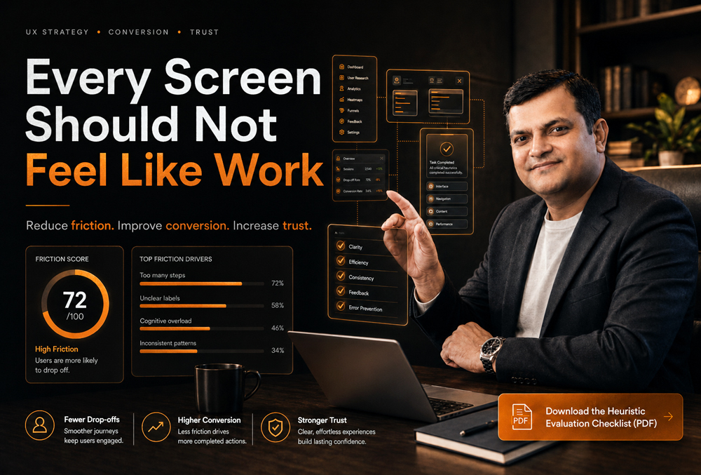
- The Problem: High churn and low conversion aren’t always product-market fit issues. Often, they are caused by cognitive overload-your users are mentally exhausted by complex interfaces before they reach the “aha” moment.
- The Impact: Every extra click, competing CTA, or unclear hierarchy destroys trust and increases your support load. Good UX is a revenue driver, not just a coat of paint.
- The Solution: A rigorous UX audit acts as a diagnostic tool to map friction points, simplify decision-making, and directly boost retention and MRR.
Too many actions, weak hierarchy, unclear priorities, and competing CTAs do not make a product powerful. They make users mentally tired before they reach value.
I have spent over 20 years looking at enterprise platforms and SaaS products. When founders come to me, they usually say the same thing: “We have great features, but our users keep dropping off during onboarding.”
My response is always the same. I don’t talk about making things look pretty. I look at the math. I look at the friction. If your product feels like work, users do not blame “cognitive load.” They say things like:
- “I don’t understand what to do next.”
- “This feels complicated.”
- “I’ll come back later.”
- “Can someone help me?”
- “Let me check another option.”
That last sentence is incredibly expensive. Because once a user leaves the flow, your acquisition cost, sales effort, onboarding effort, and retention risk all increase.
Why Screens Feel Like Work: The Slow Build of Complexity
Most product teams do not intentionally create complex products. Complexity usually builds slowly over time.
A new feature gets added. A second CTA appears. A product manager wants one more filter. Sales asks for another field. Marketing adds a banner. Compliance adds a confirmation step. Leadership wants every feature visible on the dashboard.
After six months, the product has more capability, but significantly less clarity. The screen starts competing with itself. The user does not know what matters first, what is optional, what is risky, and what action will move them forward. That is not a visual design problem alone. That is a decision architecture problem.
The Real UX Friction Is Not Always Clicks. It Is Thinking.
Many teams measure UX friction only by counting clicks. That is incomplete. A 3-step flow can still feel heavy if every step is confusing, while a 7-step flow can feel perfectly smooth if every step is clear.
The real question is not: “How many clicks does it take?” The better question is: “How much interpretation does the user need before taking the next action?”
| UX Problem | What the User Feels | The Business Impact |
| Too many CTAs | “Which one should I click?” | Lower conversion rates |
| Weak hierarchy | “What matters here?” | Slower task completion |
| Long forms | “Why do they need this?” | Form abandonment |
| Unclear labels | “What does this mean?” | Increased support tickets |
| Hidden value | “Why should I continue?” | Poor activation / Churn |
| Inconsistent patterns | “Did something change?” | Brand erosion and lower trust |
This is why conversion UX is not simply about making buttons bigger. It is about making the next decision obvious.
The 4 Screens That Usually Leak Revenue
In my UX audits, I consistently see revenue leakage concentrated around a few high-impact areas. These are the screens founders and product leaders should inspect first.
1. The Onboarding Screen
Onboarding fails when it teaches the product instead of moving users toward the first meaningful outcome. Bad onboarding explains features. Good onboarding creates momentum by answering:
- What is this product helping me achieve?
- What is the first action I need to take?
- How long will this take?
2. The Dashboard
A dashboard is not a storage room for product features; it should work like a command center. If everything is equally visible, nothing is strategically visible. Nielsen Norman Group explains that strong visual hierarchy guides the eye toward the most important elements through contrast, scale, grouping, and layout. A strong dashboard tells the user exactly what needs attention and what they should do next.
3. The Pricing or Upgrade Screen
This is where many SaaS products lose serious money. The user is interested, but the pricing page makes the decision harder due to too many plans, similar-looking feature lists, or unclear ROI. Hick’s Law states that more choices usually increase decision time. In UX, this matters because delayed decisions often become lost decisions.
4. The Form or Checkout Flow
Forms are trust tests. Every field asks the user to spend attention. Baymard Institute’s research places the average documented online shopping cart abandonment rate at over 70%. While not all abandonment is UX-related, unclear cost, friction, weak trust, and checkout complexity are massive conversion killers.
The UXGen Screen Friction Framework
When we audit a product at UXGen Studio, we do not start with “make it look better.” We diagnose where the screen is creating business resistance.
- Attention Load: How many things are fighting for the user’s attention? If the user cannot instantly identify the main action, the screen is leaking focus.
- Decision Load: How many choices does the user need to compare? The product should not force users to become analysts before they become customers.
- Memory Load: How much information must the user remember from previous steps? Good UX keeps context visible. Bad UX makes users carry context in their heads.
- Trust Load: How much doubt is created before the user acts? Trust is built when the product behaves clearly at every decision point (e.g., clear cancellation, explained permissions).
- Recovery Load: What happens when users make a mistake? A product feels mature when users can recover without panic via clear error messages and undo options.
How to Reduce Cognitive Load Without Weakening the Product
Simple UX does not mean fewer features. It means fewer unnecessary decisions. McKinsey’s research on the business value of design found that top-quartile design performers grew revenue significantly faster than industry peers. They did this by connecting design to business performance, not treating it as surface polish.
Here is how you execute this practically:
- Use One Primary CTA Per Screen: Every key screen should have one dominant action. Secondary actions can exist, but they should not compete visually.
- Group Related Information: Users scan faster when related items are visually grouped. Use cards, sections, and progressive disclosure.
- Replace Generic Labels With Decision Labels: Change “Submit” to “Get My Audit Report” or “Continue” to “Continue to Pricing.” Clear labels reduce doubt, and reducing doubt increases conversion.
- Show Progress in Multi-Step Flows: Progress indicators reduce anxiety because users can estimate the remaining effort.
- Make Defaults Strategic: Do not make users compare everything from zero. Use smart defaults like a pre-selected billing cycle or a recommended plan to reduce unnecessary decision effort.
UX Metrics That Reveal Whether Screens Feel Like Work
You cannot fix what you do not measure. For serious product teams, these UX metrics matter more than opinions:
- Task Success Rate: Can users complete the intended action?
- Time on Task: How much mental effort does completion require?
- Drop-off Rate: Where does user motivation break?
- Support Tickets per Flow: Which screens create operational load?
- Trial-to-Paid Conversion: Is the product creating enough confidence to drive revenue?
Why UXGen Studio Is the Best Partner for Solving This
UXGen Studio is not a generic UI design vendor. We specialize in UX Audit & Conversion Intelligence. We do not enter a product to change colors; we diagnose where the experience is creating hesitation, operational drag, and revenue leakage.
Our work focuses on four commercial outcomes: higher conversion, faster activation, lower support dependency, and stronger trust at decision points.
Case Study: Reducing Decision Load in a SaaS Trial Flow
The Context: A mid-size B2B SaaS company had strong traffic and decent trial signups, but trial-to-paid conversion was weak. The product had many useful features, but new users were not reaching the core value fast enough.
Our Approach: We performed a screen friction audit. We found that the first dashboard had no clear primary action, setup tasks were shown before the user understood the value, and upgrade prompts appeared before trust was built.
The Outcome: We reduced the first onboarding path to one core activation task, created a clearer dashboard hierarchy, and reworked upgrade CTA placement. Within 45 days, the client saw:
- 31% improvement in onboarding completion.
- 22% reduction in setup-related support tickets.
- 18% lift in trial-to-paid conversion.
As the client noted: “We did not need more features. We needed users to understand the value of the features we already had.”
Frequently Asked Questions (FAQ)
What is cognitive load in UX design?
Cognitive load in UX design means the mental effort users need to understand and use a product. If a screen has too many choices, unclear labels, or confusing next steps, the user has to think harder. This slows action and directly impacts conversion.
How does cognitive load affect conversion rates?
Users delay decisions when the interface feels unclear. If they cannot understand the offer, compare options easily, or trust the next step, they abandon the flow. Reducing unnecessary thinking naturally improves conversion.
Is simplifying UX the same as removing features?
No. Simplifying UX means organizing complexity better. A mature product can have many features, but good UX reveals the right feature at the right time based on the user’s intent and stage, rather than showing everything at once.
Why do users abandon forms?
Users abandon forms when the mental effort feels higher than the perceived value. Long forms, unclear field labels, poor error messages, and a lack of progress indicators all increase mental effort and drive drop-offs.
When should a startup invest in a UX audit?
You should invest in a UX audit when traffic is coming in but conversion is weak, users sign up but do not activate, or support tickets repeat around the same flows. These are signs of friction, not just marketing issues.
Your Next Step: Evaluate Your Own Product
If your product feels heavy, growth gets expensive. Users reward products that help them move faster and decide with confidence.
Identify the screens silently hurting your conversion, activation, and trust today.
📥 Download the Heuristic Evaluation Checklist (PDF) here
(A comprehensive framework my team uses to identify revenue leaks and cognitive overload in enterprise platforms).
Previous Post

Training Dependency Is a Hidden Revenue Leak in SaaS Products
Next Post
Your Website May Be Killing Trust Before Your Sales Team Gets a Chance

About the Author
Latest Posts


Subscribe for fresh
tips & top articles
UXGen Studio uses the data submitted through this form to send you relevant marketing insights, blog updates, and learning resources. To learn more, read our Privacy Policy.
